Vertical
D2C Insurance Provider
Our team
Creative Director, UX Researcher, 2 Designers, Copywriter
Client team
CEO, Lead Product Manager, + Executive Team
View WebsiteThe Brief
Guardian as a whole in recent years has created a more direct, consumer-friendly experience for its customers, including the launch of Guardian Direct, a project Wolf&Whale helped collaborate on in the past.
This time, Guardian Dental Exchange reached out to Wolf&Whale to help re-imagine the web experience for their popular dental plans offered on healthcare.gov and state exchanges.
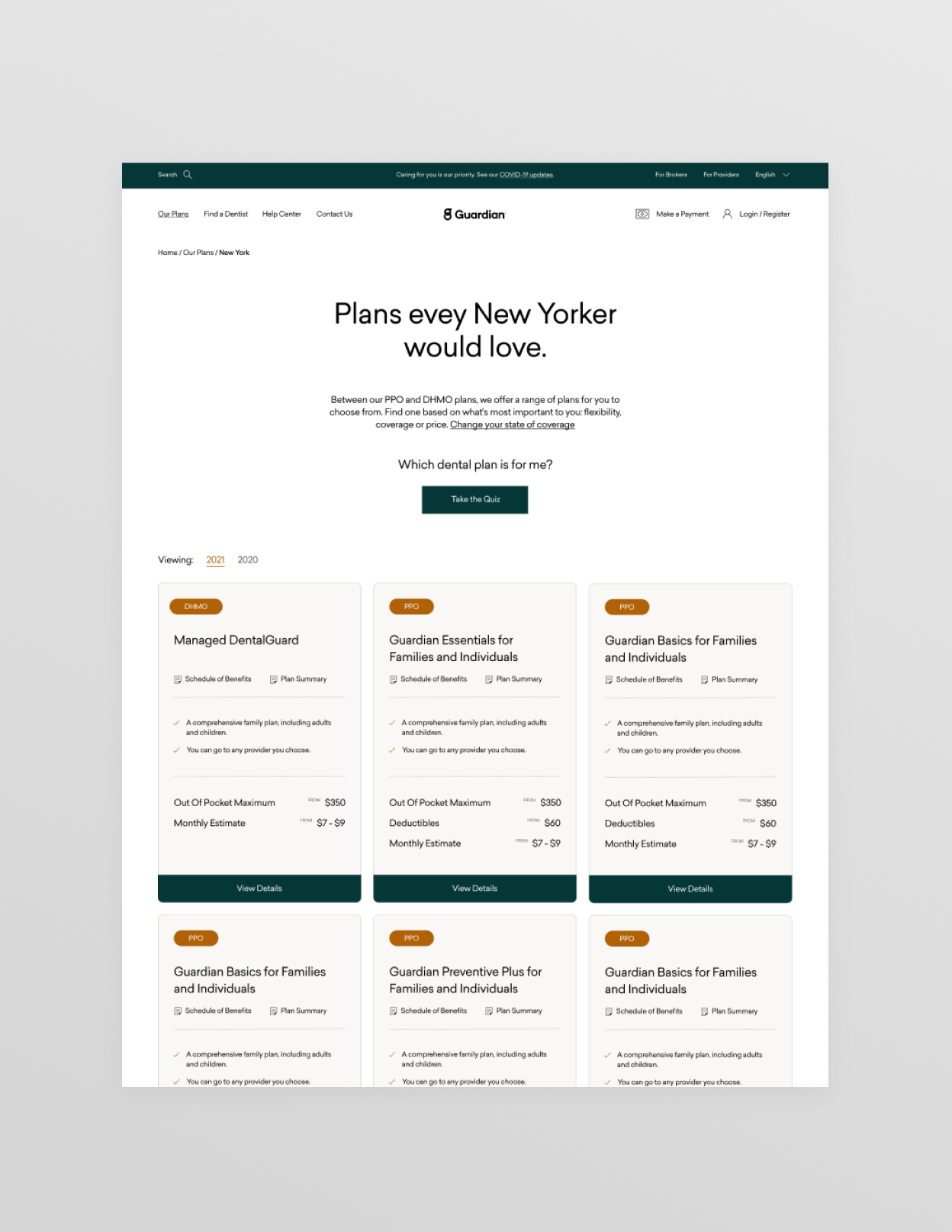
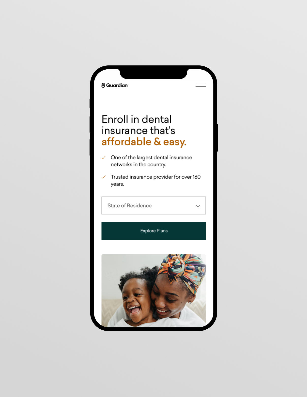
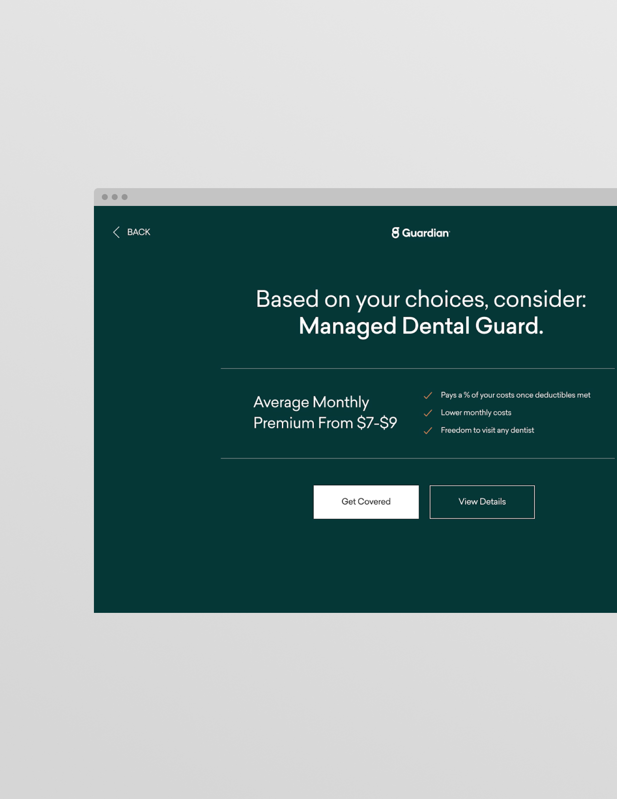
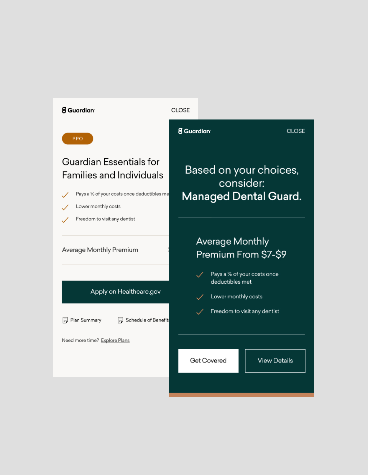
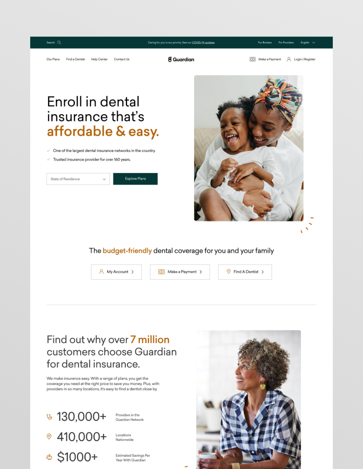
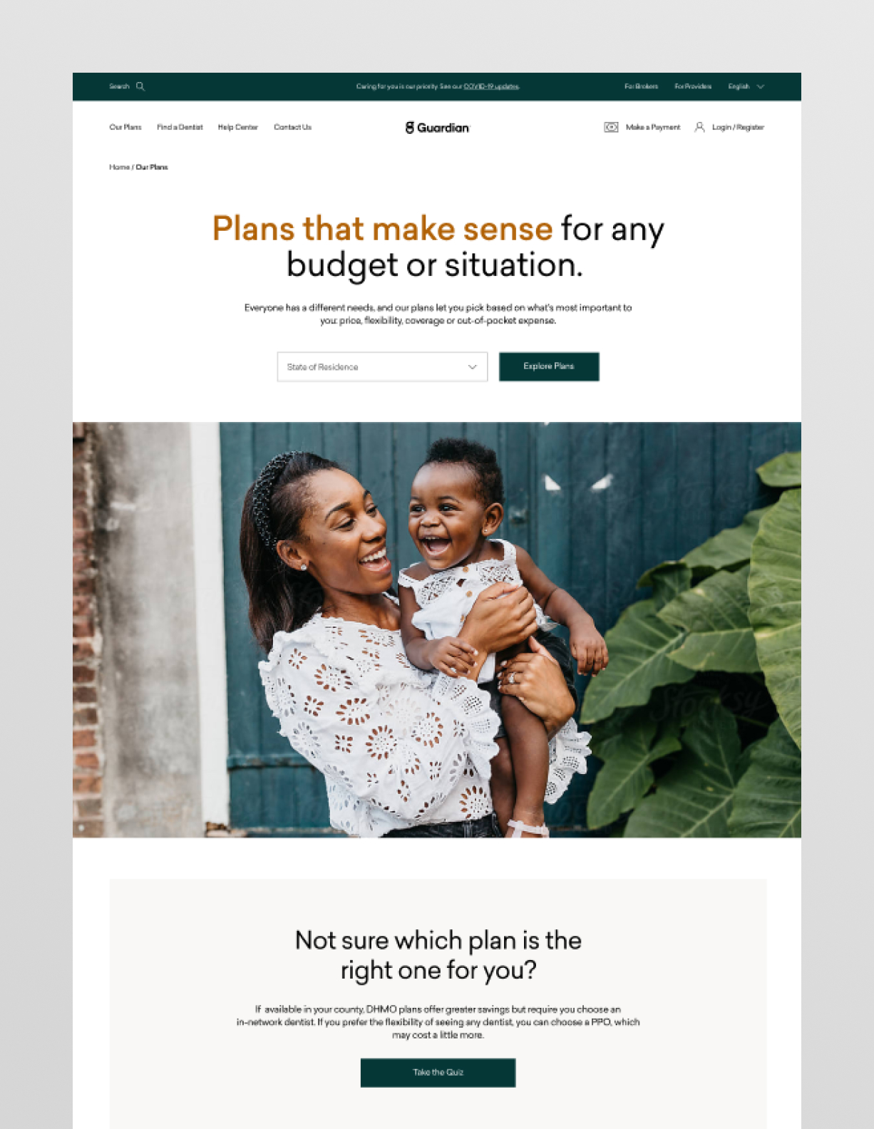
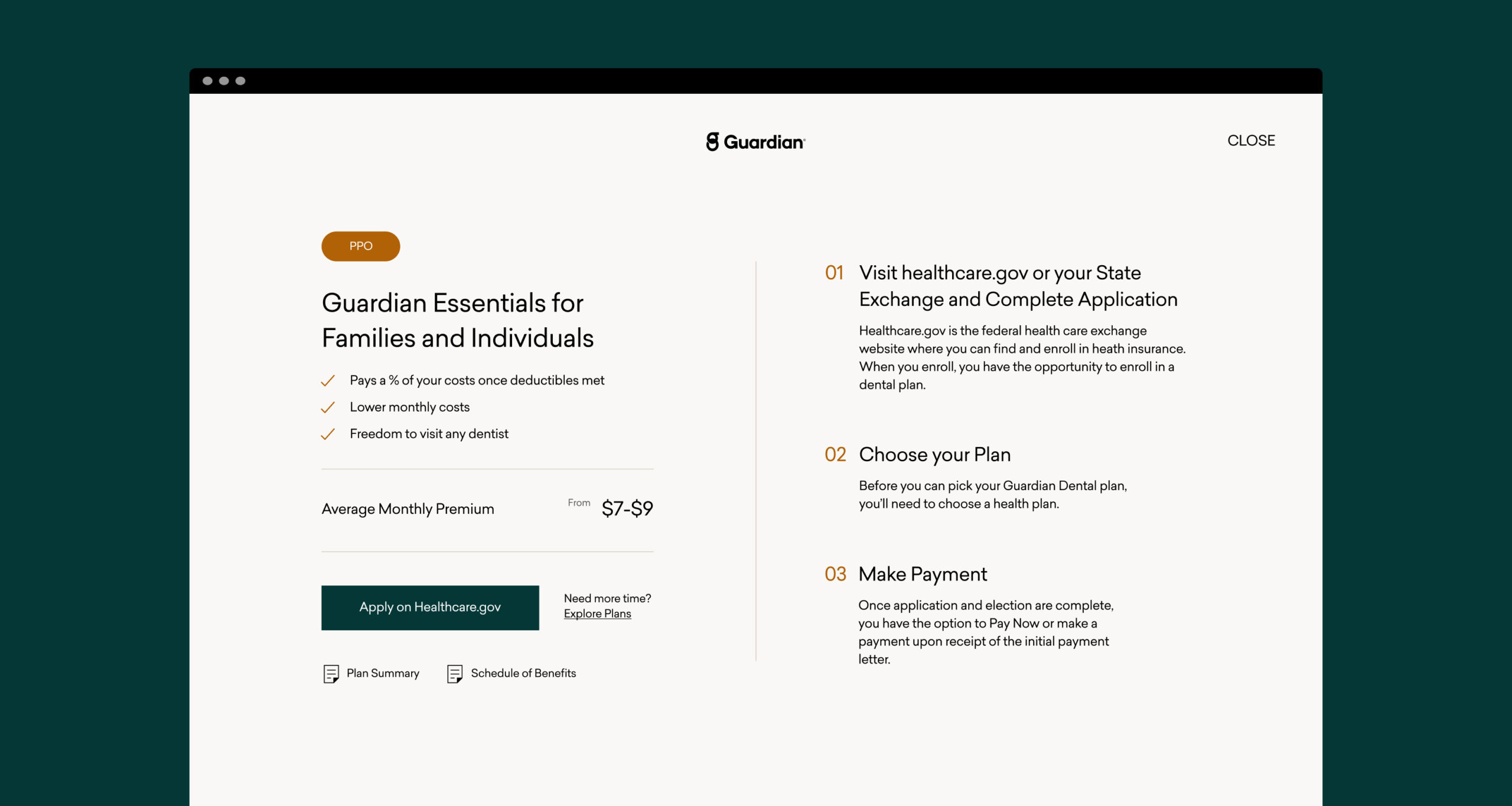
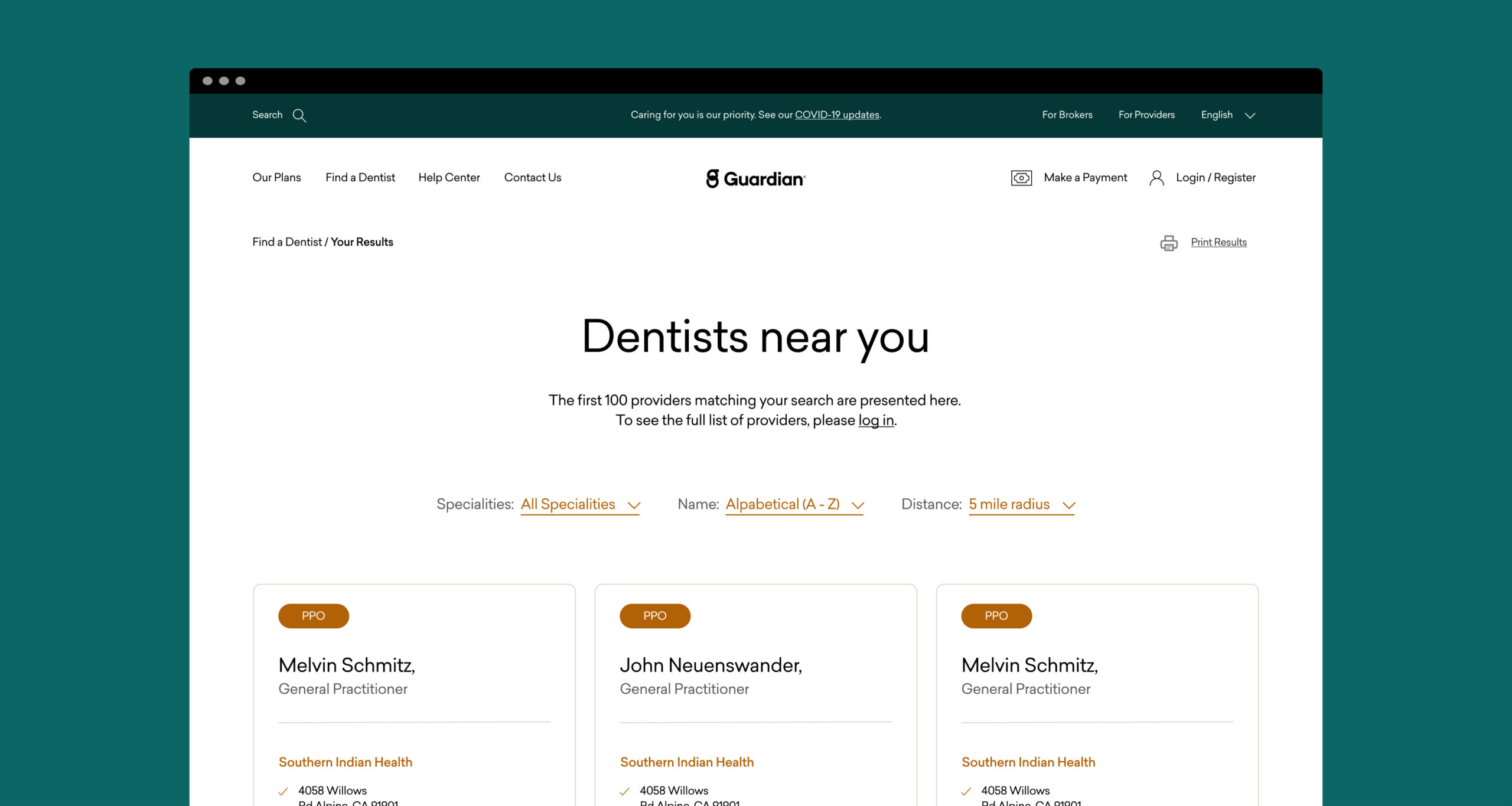
As part of the re-haul of the dental exchange website, the mission was to make it feel educational and transparent for consumers, helping them understand which plans were the best fit, as well as how to enroll in plans through a complicated online federal/state marketplace.
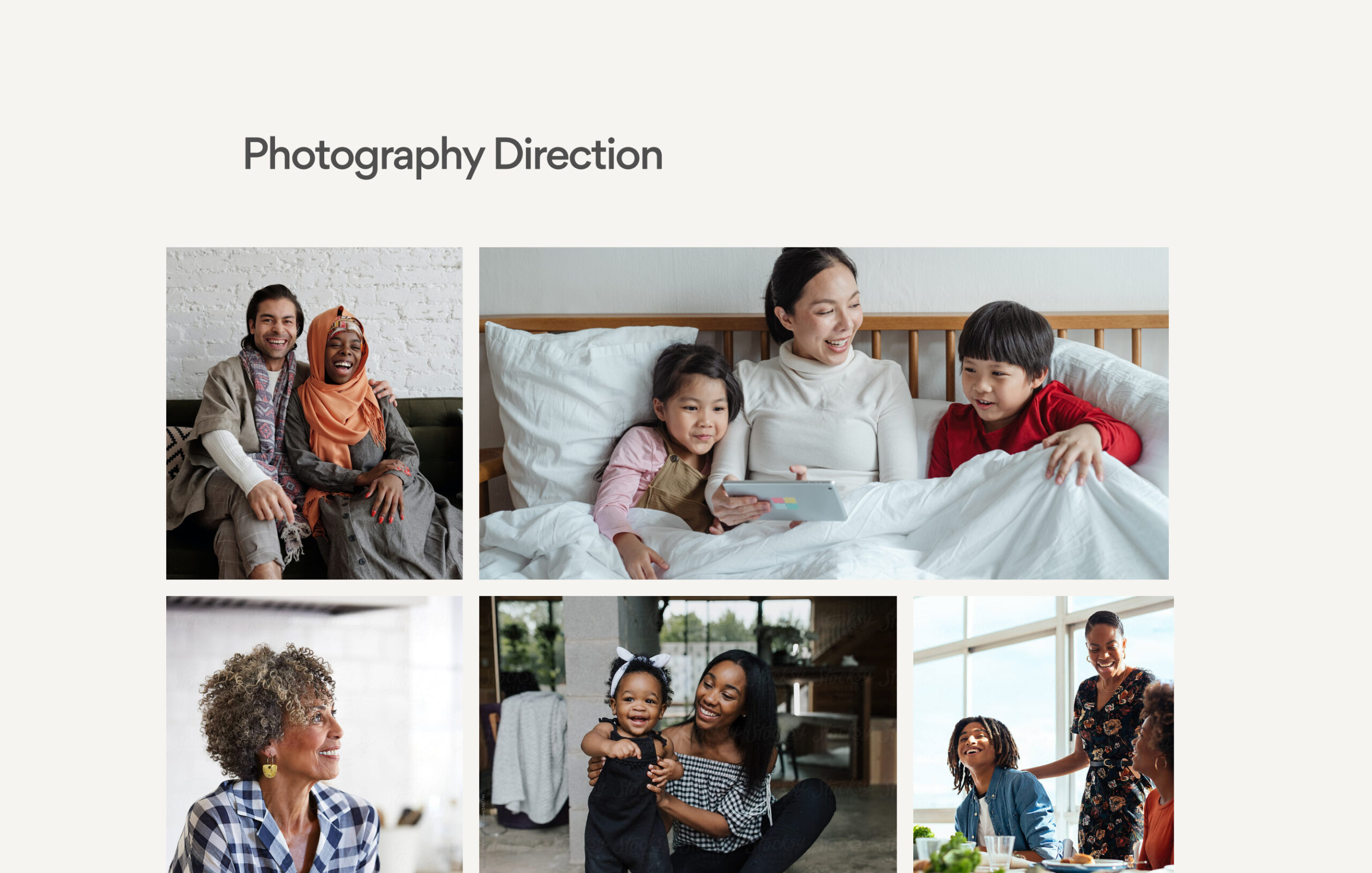
Guardian Dental Exchange wanted their website to stand out for their diversity, approachability, and credibility, while still fitting into the ecosystem of all Guardian brands and services.
Form and function
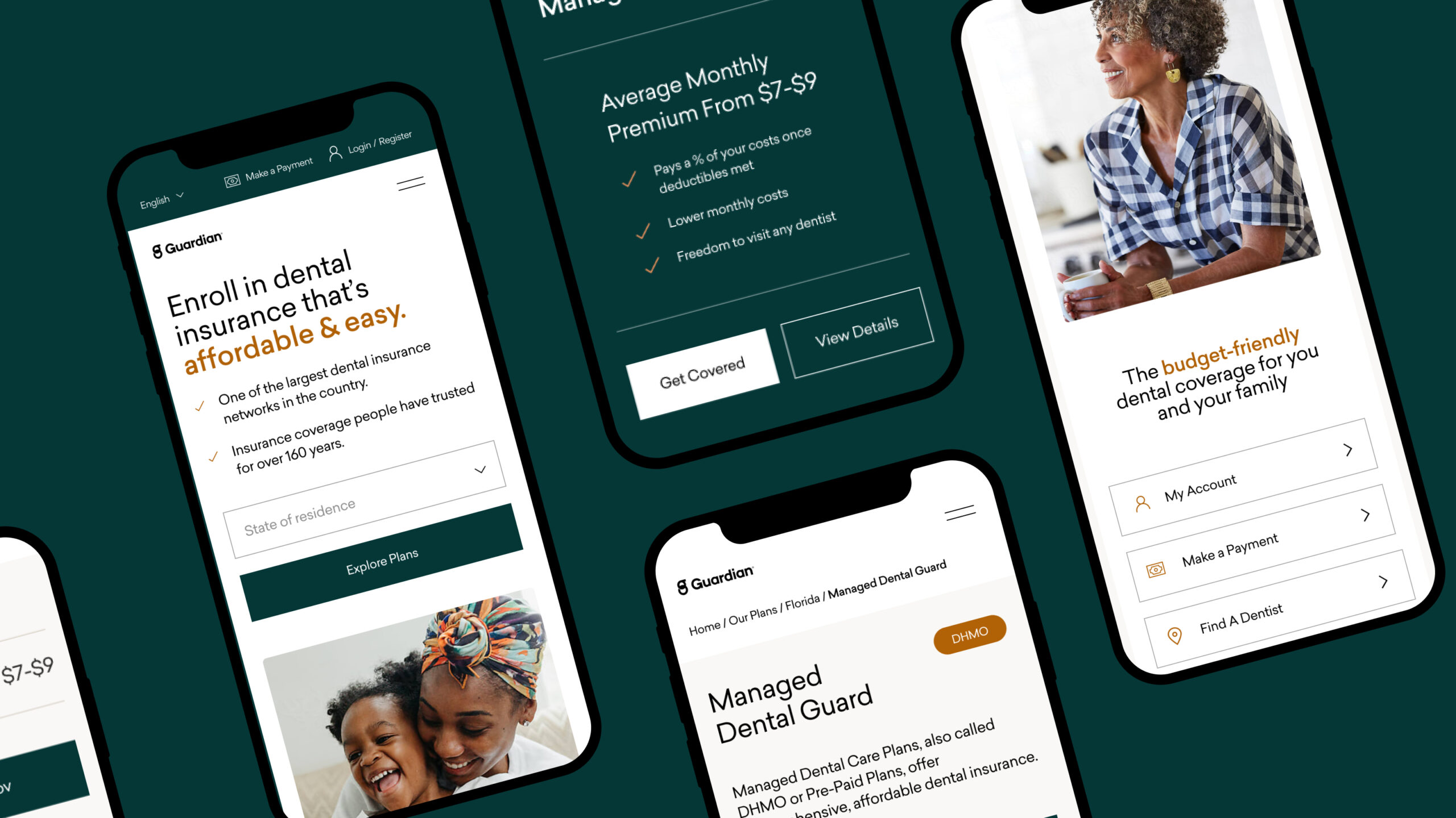
The result of our collaborative design process and testing led to a design that felt on-brand, reflecting the experience principles, and validated by target consumers. The tone in our copywriting was approachable, easy to understand, and clarifying. The user experience of features like the cost savings calculator, find a dentist, onboarding, and plan discovery helped provide a level of transparency and guidance that was previously difficult to come by. The new website launched in the Fall of 2021, just in time for open enrollment.
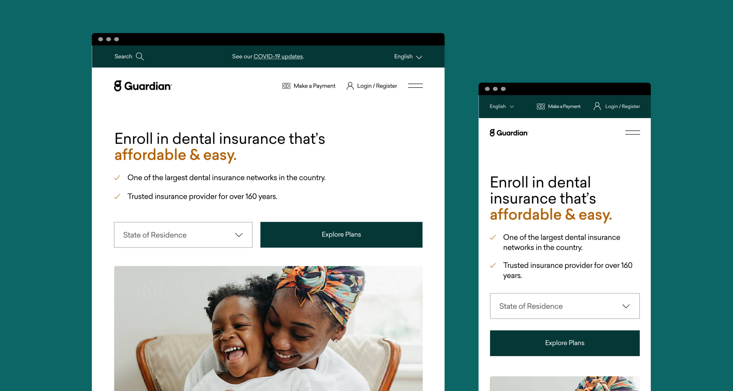
Fully Responsive Templates
Templates for any Device
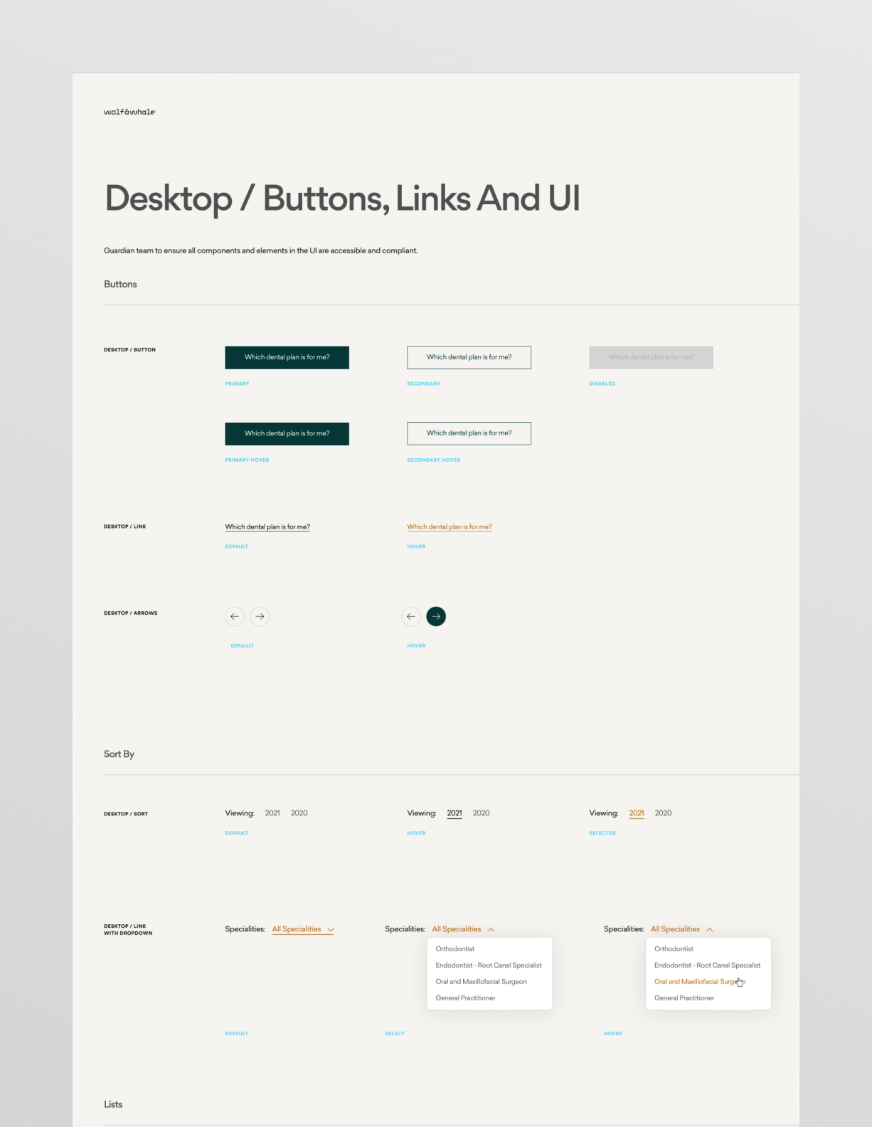
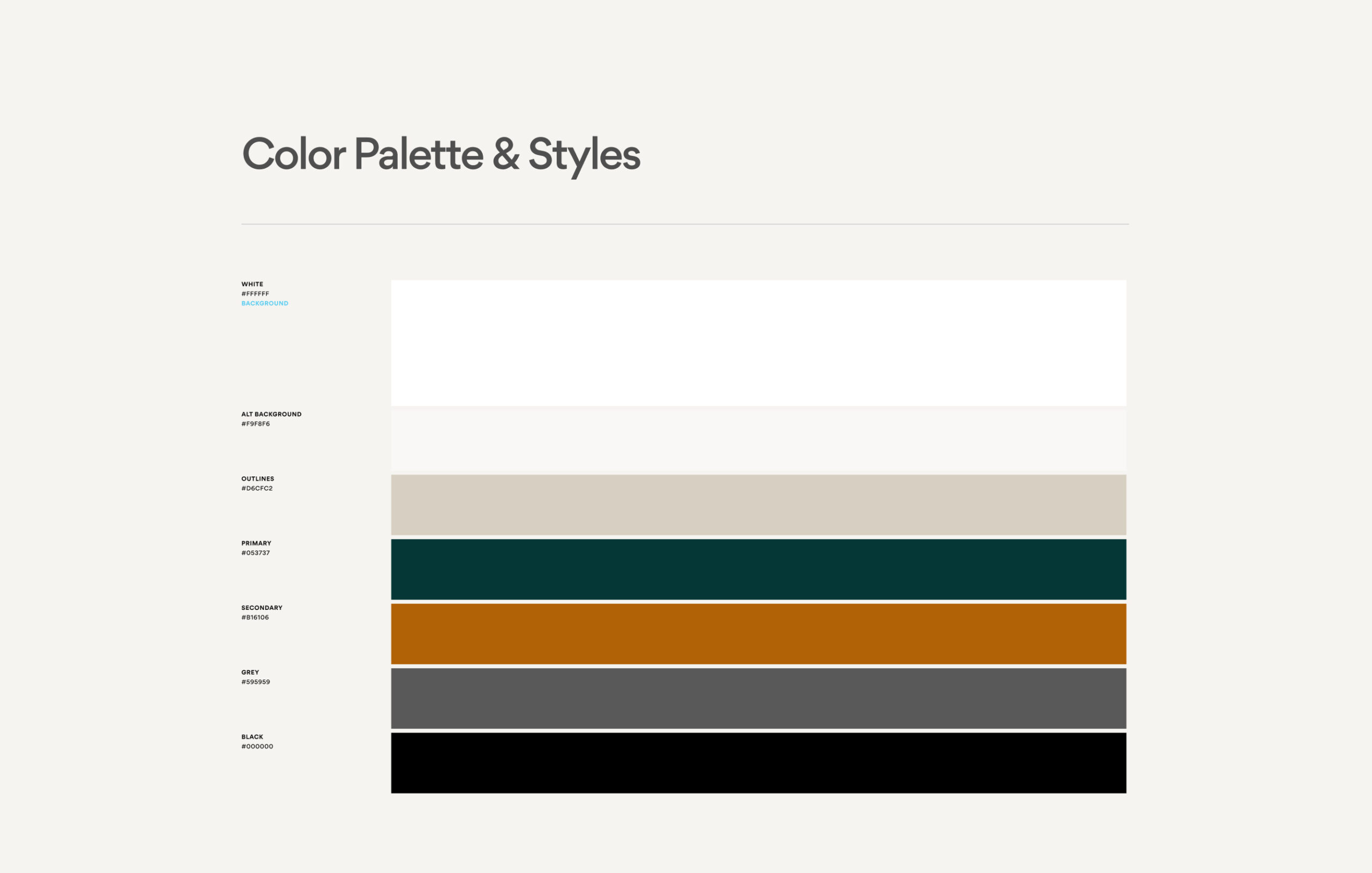
Design System
Explore Plans
“The team showed great attention to detail, diligence, and flexibility throughout the project. They provided a great foundation of design and function for our team to move forward with."